Japanese and Western graphic design differences
1→10のデザイナー、インドネシア出身のエルウィンです。
今回は、日本に住み、働く外国人の視点から、
日本のデザインについての洞察を共有したいと思います。
日本のデザインは西洋の国のデザインとは大きく異なります。
日本建築、ファッション、グラフィックデザインは、
世界中のデザイナーはもちろん、デザイナーでない人にも愛されています。
では、日本と西洋の国のグラフィックデザインは何が違うのでしょうか?
そして、日本のグラフィックデザインがユニークな理由はどこにあるのでしょうか?
その疑問に答えてくれるとてもいい記事がありました。
shillington Education
この記事は日本の歴史と、西洋のグラフィックの歴史の違いから始まり、7つのカテゴリーで日本と西洋のグラフィックを比較しているものです。
私はそれに共感したので、彼の記事をベースにしながら、
私の視点も加えて文を書きたいと思います。
Hello I’m Erwin, designer in 1-10, today i want to share my insight on Japanese design from the perspective of foreigners who live and work in Japan.
It’s obvious that Japanese design in general is different, somewhat unique to their counterpart in western country.
the Japanese design that encompassed in architecture, fashion and graphic design is admired by people, if not, maybe all designers around the world.
it same in some part yet you can tell it uniqueness. because of the very unique Japanese approach, from culture to history.
So what makes graphic design in Japan and Western country is different?
and what makes Japanese graphic design is so unique ?
And here’s a good article that can answer to that question
The article itself is begin with the history of Japan and Western design, and later the writer compared the differences into 7 categories, and from that article i found it very interesting for me, so i would like to share my point of view of what makes the Japanese and Western graphic design is different.
Let’s begin with
歴史 | History
明治維新前 | Before Meiji Restoration
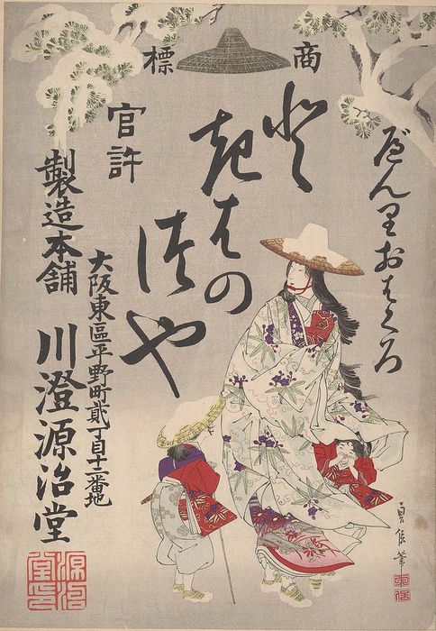
Image source : University of California | Design observer
1868年に明治維新が始まる前、日本は孤立した国でした(鎖国)。
日本の社会が他国、特に西洋からの異なる文化を遮断した時代です。
そのため、この時代に日本で栄えた文化はすべて、日本人固有の生活の中から生まれた文化です。
Before the Meiji restoration era is begin in 1868, Japan was a isolated country. It means it is hard for Japanese society to experience a different culture from other country especially the western country. So all the culture that flourish within Japanese border is came from inside and rooted very strong in Japanese peoples live.
明治維新後 | After Meiji Restoration
| Japanese graphic design that already got an influenced with western art and graphics
image source kansai artbeat | Tumblr | Pink tentacle
グラフィックでした。| the western graphics that influenced Japanese graphics in Meiji Era mostly come from europe.
Image Source : Reddit | Wikipedia | Post Auctioner | Pinterest
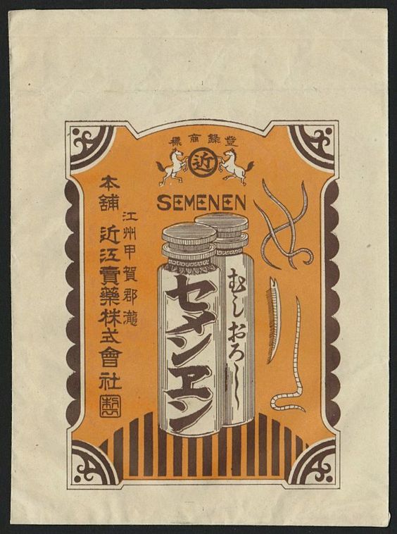
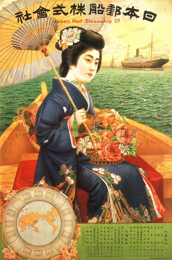
明治維新が始まると、日本は西欧諸国(ヨーロッパやアメリカ)との国境を開き始めました。市場貿易の開放だけでなく、アートやデザインの文化交流にも影響が及びました。そして日本の伝統的な芸術に西欧の芸術/デザインが、また文化にも同化していきました。
When the Meiji restoration begin, Japan start to opening their border from western country (Europe and America), not only open to market trade but also it is affecting the cultural exchange in art and design, which is incorporated the Japanese traditional art with western art. It’s the beginning of art, design and cultural assimilation.
世界大戦後、昭和の時代 | Showa era post-World war
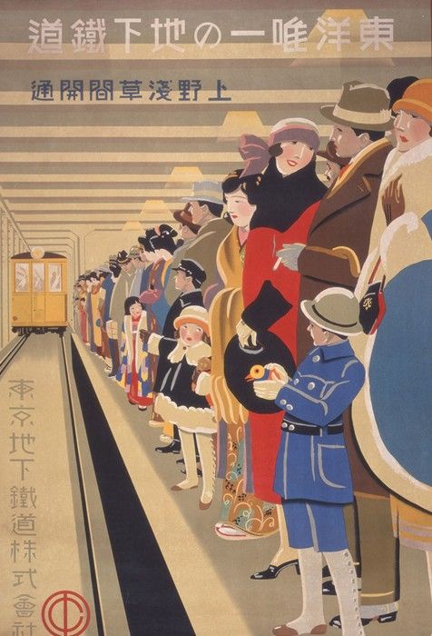
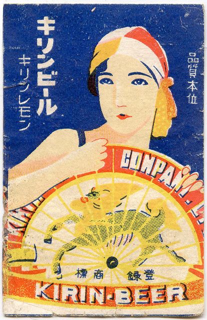
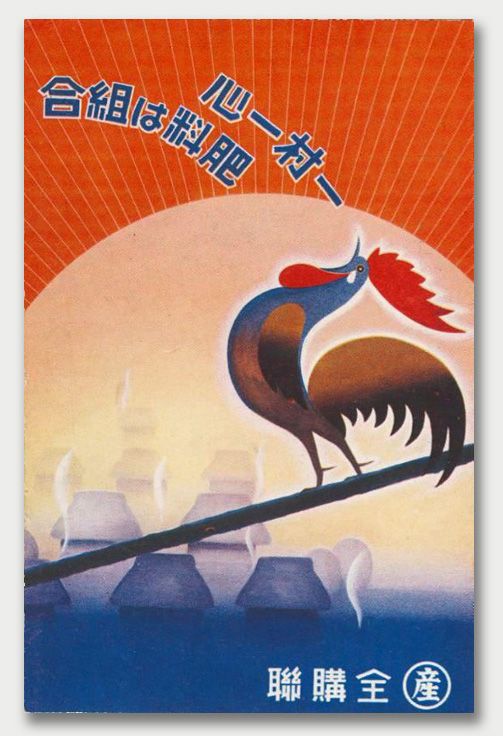
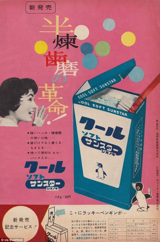
強くでています。| the influence of constructivism and bauhaus is there, but the Japanese touch is getting stronger in the graphic design.
Image source : The Mainichi | Flickr | Japan War Art | Daily Mail UK | Flasbak
Image source : The Marginalian | Square mile | Socks Studio | Boooom
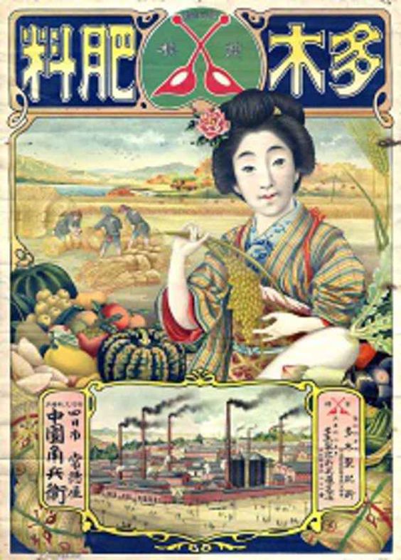
日本が敗戦した第二次世界大戦後、日本のグラフィックデザインは盛んになり、それは戦後のグラフィックデザインと呼ばれています。
それは、日本が経済的な上昇を経験した1950年から1980年頃に起こったもので、グラフィックデザインは新しいプロモーションの方法としてこの経済を助けました。
After the world war 2 when Japan lost in war, the Japanese graphic design is getting flourished and it’s called as Post-war Era graphic design. It happen around 1950 to 1980 when Japan experiencing the economic rise, where graphic design find the way to help and be a part of new economy. This era is one of the crucial and important era for Japanese graphic design, where Japan is actively inventing new technology, trend, and become a global player along other big country such as America and England, so the Japanese graphic design is helping the economy with the creativity in promoting Japan new era on the creative side.
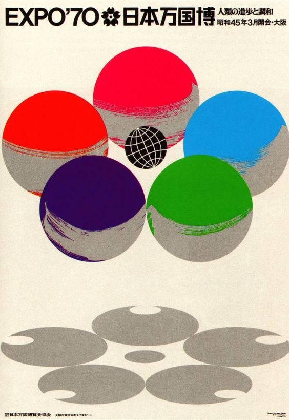
ポストモダニズム1990年代 | Postmodernism 1990’s
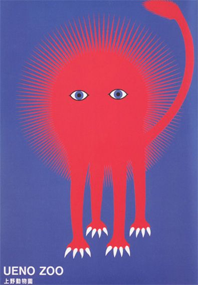
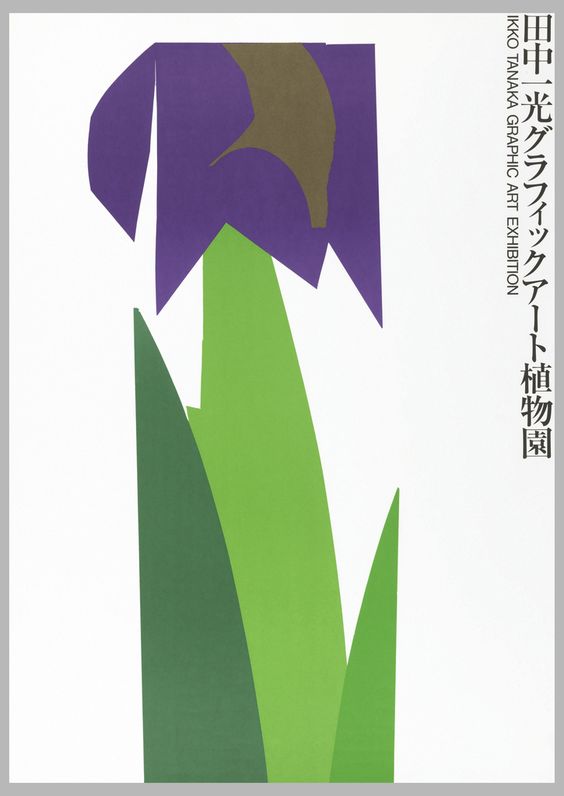
Image source : Readymag | MoMA | UMMA Exchange
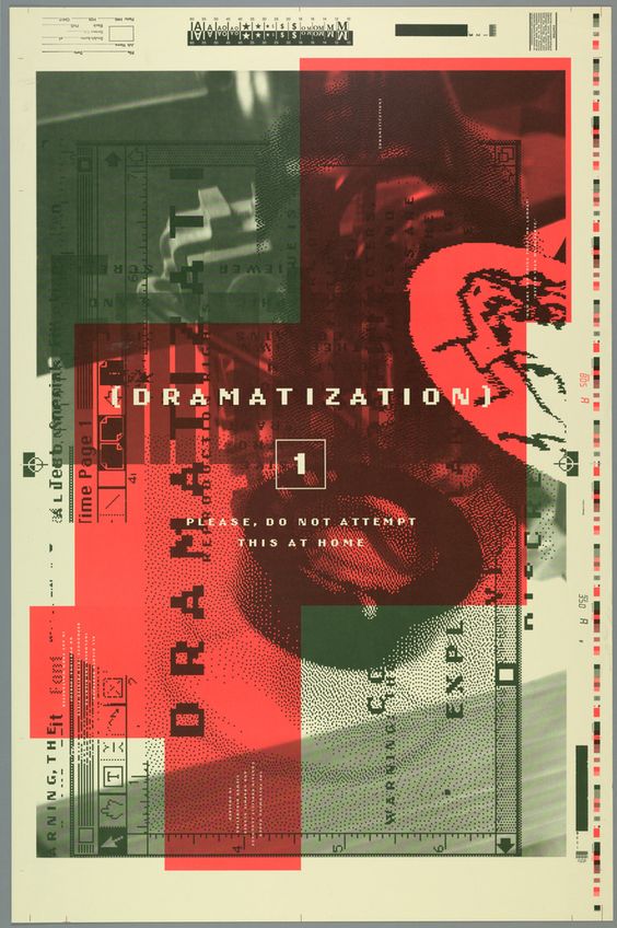
Image source : International poster | Rafaoricco | Copper hewwit
経済成長後の日本は、90年代から2010年まで、経済が停滞しするという転機を迎えます。しかし日本のグラフィック・デザインは、厳しい時代にもかかわらず、ポストモダニズムの流れに沿って変化し続けるという牽引力を発揮しました。日本のグラフィックデザイナーは、日本の文化とポストモダンデザインを融合させることで、独自のスタイルを確立することに成功しました。
After the economy rise, Japan experiencing another turning point or pivotal point, where the economy is in stagnant and gradually went down around the 90’s until the first decade of 2000. In this era even though the time is hard, the Japanese graphic design found its traction to keep changing and following the trend of postmodernism. Japanese graphic designer already create their own style by incorporating their Japanese culture with postmodern design, and the result is uniquely Japan.
日本のグラフィックデザインの歴史に関する詳細な記事については、
下記のリンクにアクセスしてください。
For further article about Japanese graphic design history you can visit this link :
Britannica A | Britannica B | Japan Institute of Design Promotion | Guity Novin blog
______________________________________________________________________________
特徴 | Characteristic
序盤で紹介した記事には、日本のデザインは以下の
7つのカテゴリーとして分類されていました。
1.ミニマリズム
2.カワイイ
3.カスタムタイポグラフィー
4.ネイチャー
5.シンボリズム
6.幾何学
7.花
私自身の見解は以下になります。
- 書記体系 | Writing System
- シンプルさ | Simplicity
- 可愛いキャラクターカルチャー | Cute Culture
- 伝統的なクラフト | Traditional touch craft
In the article I introduced earlier, the writer categorized Japanese design uniqueness into 7 category.
- Minimalism
- Cute
- Custom Typography
- Nature
- Symbolism
- Geometric
- Flower
And my own view as it follows based from the article are
- Writing system
- Simplicity
- Cute Culture
- Traditional touch craft
With the long history of art and culture, mixed with european and american graphic design style, Japanese graphic design is getting more and more unique and deserved their own style in art and culture world especially in graphic design world.
so what makes Japanese design is so unique ?
first and foremost if its not obvious is….
- 書記体系と作字されたタイポグラフィ | Writing System and custom typography
日本語、特に漢字にはそれぞれその文字が作られた歴史があり、
その文字を象徴するモチーフがあります。
例えば、『山』はその名の通り、やまの形を表していて、
『雨』はあめが降る動きを表しています。
それゆえ、日本のグラフィックデザインではしばしば、
漢字を使ったタイポグラフィーのデザインに意味から派生した
形状のアプローチが見られます。
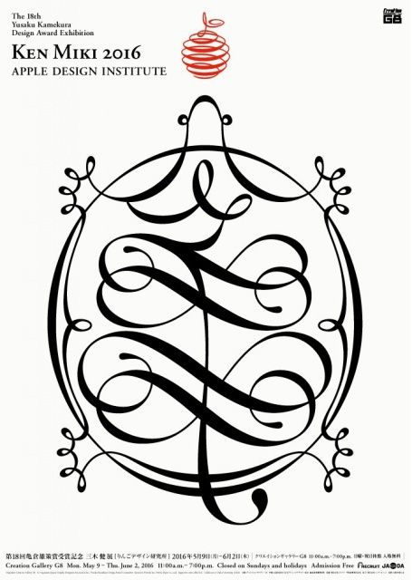
例えば左の画像では『亀』という漢字インスピレーションを広げ、
生き物の亀のシルエットを作り出しています。
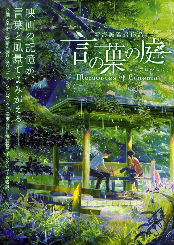
右の画像、新海誠の映画『言の葉の庭』では
『葉』や『庭』という漢字にそれそれ葉っぱのシルエットや、
庭を想像させる土から、植物が生えたようなシルエットが
デザインされています。
西洋のアルファベット一文字(例えばA)には、意味がない
ただの図形なので、このデザインスタイルが私には
とても新しく感じました。
Japanese language, especially Kanji, has a history of its own, and each character has its own history and motifs that symbolize it.
For example, “山” (Mountain), as its name suggests, represents the shape of a mountain.
For example, “山” (Mountain) represents the shape of a mountain, and “雨” represents the movement of falling rain.
Therefore, in Japanese graphic design, there is often an approach to shape derived from meaning in typographic designs using kanji.
For example, in the image on the left, the kanji inspiration for “亀”(Turtle) is expanded to create a silhouette of a living turtle.
In the image on the right, from Makoto Shinkai’s film “言の葉の庭” (The Garden of Words), the kanji for “葉” (Leaf) and “庭” (Garden) are used to create silhouettes of leaves and other shapes.
The silhouette of a leaf or a plant growing out of the soil is designed to remind us of a garden.It is designed to look like a plant growing out of the soil.
A single letter of the Western alphabet (e.g. A) has no meaning.
It’s just a shape, so this design style felt very new to me.
I felt this design style was very new to me.
2. シンプル | Simplicity
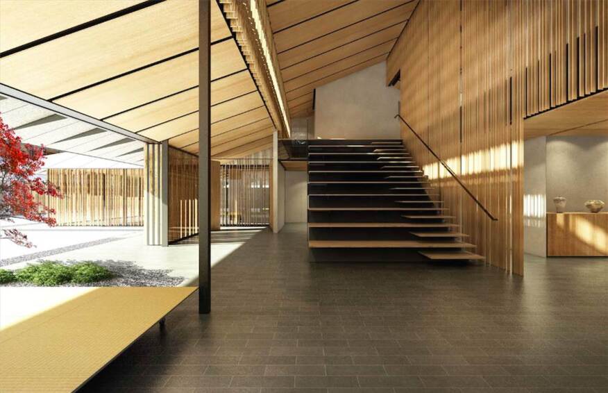
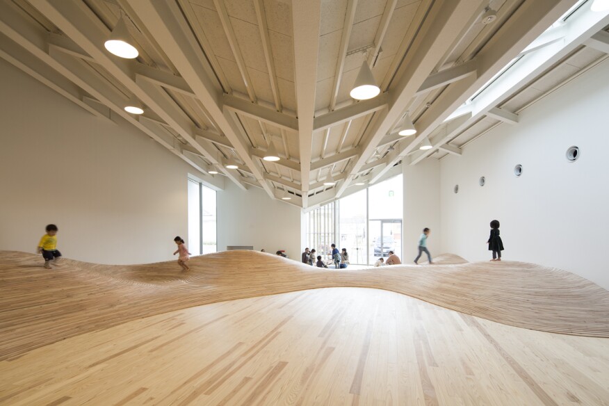
Image source : Architect Magazine (cr : Kengo Kuma & Associates & Hasegawa kenta)
日本には、禅宗という日本社会に根付いた仏教があります。禅仏教の基本的な考え方は、シンプルな生活の中に幸せを見出すことです。
外国人の私から見ると、例えば、隈研吾氏(最も著名な日本人の建築デザイナーの一人)の作品から禅の考え方をみい出すことができます。
彼の作品はシンプルさという考え方を用いて、作品を自然に立ち返らせています。持続可能性の観点から、常に自然の中で簡単に見つけることができる天然素材を使用し、自然光が作品にうまく作用するように考え、さらに彼は作品を周囲と調和させ、同時に際立たせる方法を考えています。
日本のデザイナーは、彼のようにこの禅宗の考え方を無意識のうちに取り入れ、シンプルな世界の中に無限の広がりを作り出しています。
There’s a Japanese type of Buddhism that rooted in Japanese society called as Zen Buddhism. The Zen Buddhism basic thinking is about finding happiness in simple life. Based from that teaching the Japanese designers extract the Zen Buddhism idea into more tactile world of creativity by incorporating a simple design or simple material to a simple daily use.
for example, the works of Kengo Kuma (one of the most prominent architecture designer), even though it’s not a graphic design, his works from my perspective is using the basic thinking of simplicity where he takes his works back to the basic. Such as he always use natural material that we can found it easily in the nature without forgetting the nature sustainability and thinking about how to make natural light works well with his creation, plus he always think about how to make his work blend well with the surrounding as well as stand out in the same time.
3.かわいいキャラクターカルチャー | Cute Culture
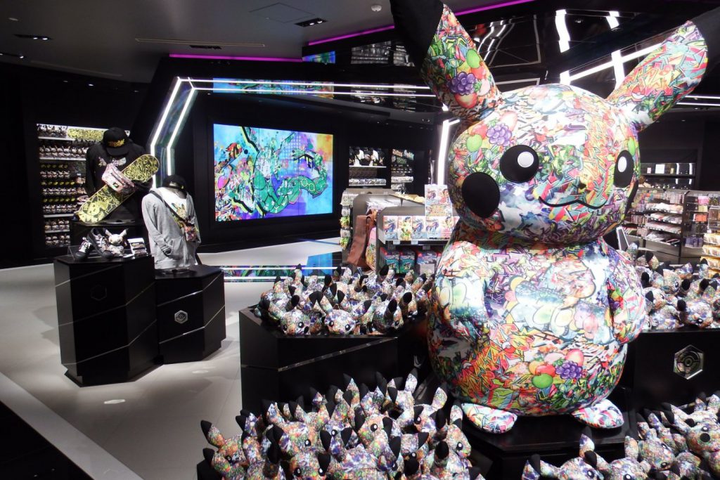
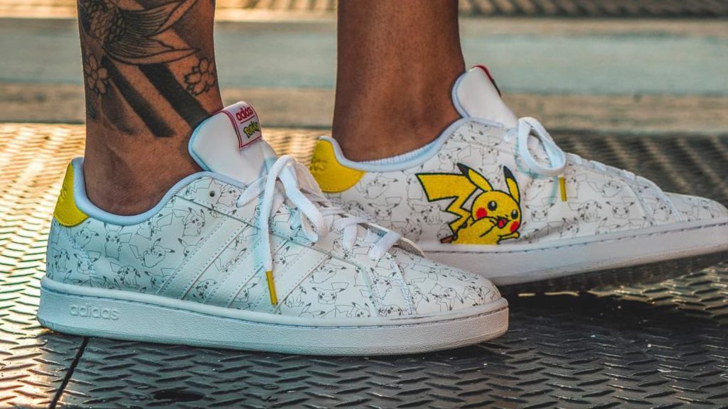
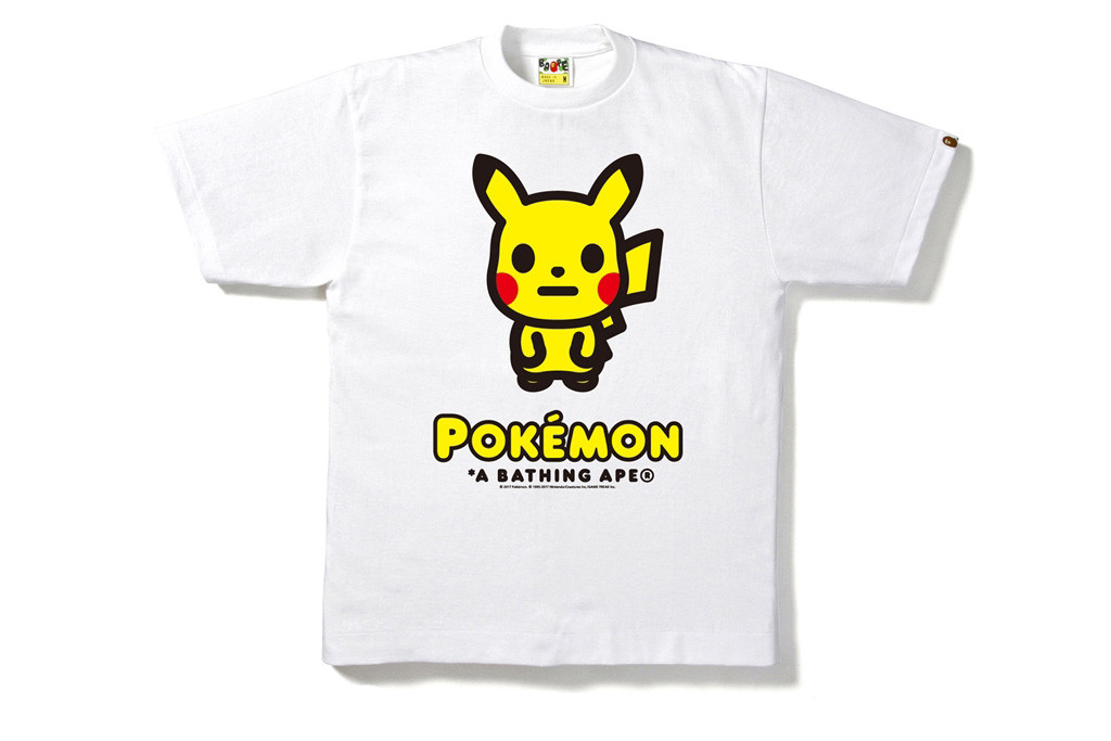
Image source : Japan travel | Sole collector | Hypebeast
外国人が日本のモダンデザインを考えるとき、かわいいデザインを思い浮かべることが多いと思います。もちろんミニマリズムを思い浮かべる人もいると思いますが、対局のかわいい文化を無視することはできません。
中でも日本のキャラクターはかわいい文化を代表するものです。
1970年代初頭から、かわいいキャラクターの文化は現代の日本のグラフィックデザインを形成する一部となっていました。単なるキャラクターからアニメ産業に至るまで、たくさんのかわいいキャラクターが生まれてきました。
例えば、世界で最も有名でキュートなアイコン、ポケモンのキャラクターたち。90年代の子供向けゲームとして始まったポケモンは、今や世界的な現象となり、ゲームとして留まるだけでなく、ファッション分野での多くのコラボレーションにも広がっています。例えば、グラフィックアートとファッションを融合させたポケモンとユニクロUTのコラボレーションや、ポケモンとアディダスのコラボレーション、また、日本のストリートウェアのハイブランドであるBAPE(Bathing ape、日本の有名なファッションデザイナーである長尾智明氏、または単にNIGOとして知られている)とのコラボレーションなどが挙げられます。
かわいいキャラクターデザインはデザイナーであるかどうかに関わらず、日本のデザインが世界から注目されるきっかけとなった、クリエイティブ業界の題材の一つでもあります。
When foreigners think about modern Japanese design, most of the times we thought about Cute design or Kawaii, well of course minimalism is what we thought too, but we can’t ignore the cute culture or Kawaii and the cute culture is like the different side or an antithesis or the opposite side of Simplicity that coming from Zen Buddhism
From the early 1970s the cute culture is already taking part in shaping the modern Japanese graphic design. Where we can see a lot of cute character, from just a character to the anime industry.
for example the most famous cute icon in the world, the Pokemon characters. start as 90’s kids game but now is already become a global phenomenon, which is not only stays as a game but also spread into different industry such as a lot of collaboration in fashion for example is the Pokemon and Uniqlo UT collaboration that mixed the graphic art with fashion or Pokemon with adidas or maybe the collaboration with the high brand of Japanese street wear BAPE (the Bathing ape, created by famous Japanese fashion designer Tomoaki Nagao or simply well known as NIGO).
cute culture of kawaii is now already fully embraced by Japanese designer and also people around the world whether they are designer or not, and also become one of the subject in creative industry that help Japanese design getting more and more attention from the world.
4. Traditional touch craft | 伝統的なクラフト
Image source : La Petit Noisette |
日本のデザインが他と違うのは、視覚だけではなく、2Dの質感にも拘っていることです。しかも日本のデザイナーは、伝統的な文化の質感を現代のニーズに合わせて巧みに組み合わせ、唯一無二のデザインを生み出しています。
What makes Japanese design is different is not only in visual but also in making something from 2D works into something more tactile, or something we can touch and feel, such as packaging. Japanese designer is clever putting their traditional culture into more modern need.
日本のグラフィックデザインと西洋のグラフィックデザインの違いは、これに限らずたくさんあるので、あくまでまでこれは私の一つの意見です。
この長い記事を読んでいただきありがとうございました!
In the end there are many differences between Japanese graphic design and Western graphic design but this is what I found and my opinion about it. Thank you for reading this long article.